Resume Design Elements and Styles: How to Choose the Best for Your Resume
in Knowledgebase on March 9, 2023Your resume is your chance to sell your experience to potential employers, catch their attention, and leave a solid first impression to improve your chances of landing a job. Even the least impressionable boss is likely to be impressed by a well-designed resume that highlights your accomplishments and is visually appealing. This could help you land your next job. This post will explore the value of resume design, typical design components, and design tips to assist hiring managers take notice of your resume.
Why is resume design important?
For the purpose of enhancing the content of the resume, resume design—that is, the layout, style, and format—is crucial. Because it makes the resume easier to read and lets the most crucial information shine out, great content is improved with the correct design. However, optimum resume style, structure, and layout change by industry, so the best appearance for your resume can be very different from that of someone in a different field.
A hiring manager may pay more attention to your resume’s keywords and job titles with the correct resume style. Utilizing fonts, spacing, and bulleted lists strategically can aid hiring managers in rapidly identifying critical qualifications. Additionally, good design, such as layout and keyword utilization, can aid applicant tracking systems in identifying your resume and assist you to get an interview.
Resume design elements
When composing your CV, pay close attention to the following components:
- Font
- Visual emphasis
- Consistency
- File type
Font
The fonts you choose can significantly alter how your resume looks. Try the following to make it interesting:
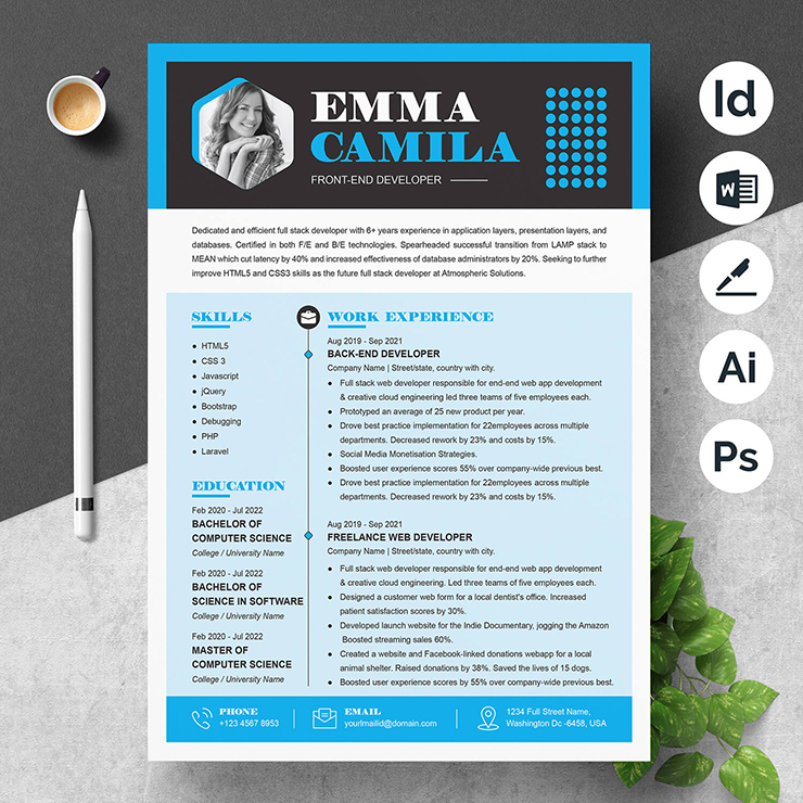
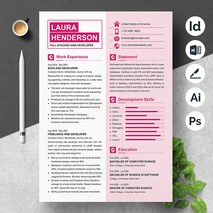
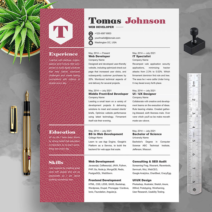
- Use two distinct fonts on your resume, one for the body of the text and one for the headers. Serif fonts, such Times New Roman or Bodoni, typically appear best for larger text, like headers, but are challenging to read when reduced to body text size. Body text that is written in a sans serif font, such as Arial or Calibri, looks tidy, uncomplicated, and is straightforward to read.
- To make text stand out, use a variety of font sizes. To direct the reader’s attention to a job title or firm name, increase the font size by one or two points.
- Bold and italic text formatting can help draw attention to important details, accomplishments, or awards. To maximize their impact, just use them sparingly. In order to make your resume easier to scan, refrain from utilizing emphasized text in the body of the document.
- To make your CV stand out, try using a font that is more unusual. Only be sure that the font you select is readable both on paper and on a computer screen, and make sure you use it consistently all throughout the work. The body content and all headers ought to be written in the same font and size.
Visual emphasis
By giving each area a distinct emphasis, you can distinguish between them clearly. Your contact information, for instance, should be prominently displayed at the top of the website. Include active links to your email address, website, and social media accounts if you’re submitting your resume electronically. Other methods to draw attention to specific aspects of the CV include:
- Organize the content based on the job description. Grouping them logically, aids in breaking up a big, tedious list of bullets.
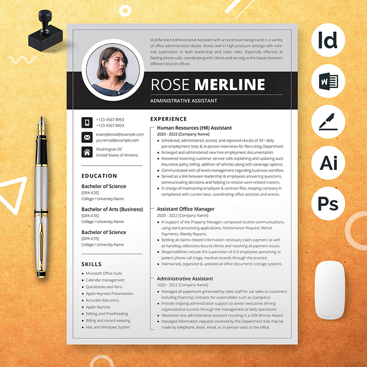
- Set your headers apart. Utilizing text boxes, shadows, shading, color, and other design elements, you can make your headers stand out. Again, use them sparingly to avoid giving off an unprofessional impression on your CV.
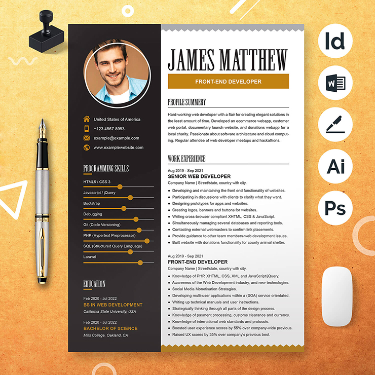
- Use graphs, charts, and icons. For Example, including a little chart next to your measured accomplishments enhances the information without taking away from it. Once or twice on the document is usually more than enough, to reiterate.
- Utilize empty space. By enabling the most crucial components, like your phone number, to be surrounded by white space, you can achieve a clean, minimalistic design.
Consistency
Being a brand, you should maintain consistency in your branding. To better associate them with your brand, your portfolio, cover letter, and resume should all have the same style, font, and color scheme.
File type
To ensure that the formatting is perfect when the hiring manager opens your resume, it is advisable to save it as a PDF. All of your font selection will be for naught if their computer doesn’t have the same typefaces as yours, and the shoddy outcome may severely harm your professional image.
Also, pay attention to the filename. The best bet is normally to include your initial and last name and the word “resume“. Before viewing a document, managers or recruiters can more easily determine what it is.
How to choose a resume design
Given the variety of resume design alternatives available today, picking the one that suits you the best may be difficult. To determine which design is ideal for you, try using these suggestions.
- Consider what identifies you.
- Stay up to date with trends and standards.
- Stick to industry norms.
- Consult resume examples
1. Consider what identifies you
You may identify the format and kind of resume required for a position in a certain industry by deciding what type of work you wish to do.
2. Stay up to date with trends and standards
Whether or whether you are looking for work, you should regularly update your resume. Your resume won’t become stale and out-of-date by performing this easy practice. A resume with a professional appearance that accurately represents you is a far better choice than outdated resumes, and it may even mean the difference between getting the job and not.
3. Stick to industry norms
As we previously stated, the design of your resume should unquestionably take your line of work into consideration. It’s better to stick with what’s acceptable in your sector because what works for one industry might not be proper for another.
4. Consult resume examples
When it comes to experimenting with layouts, designs, and colors, generic resume samples are a terrific resource. Additionally, you might discover some fresh concepts for logical and imaginative formatting that candidate tracking systems will appreciate.
Tips for styling your resume
To improve your CV and catch the attention of employers, use one or more of the following advice:
- Consider using an infographic.
- Add a personal design touch.
- Use no more than two fonts.
- Proofread.
Consider using an infographic
Your resume can be given more life and color by using infographics to visually describe some concepts that words alone cannot adequately convey. The restriction is that you have to remember who your target audience is. A colorful, graphic résumé that might violate standards of decorum is not appropriate for an administrative position at a corporation with a history of formality, but it might land a graphic artist their ideal job.
Add a personal design touch
Employ a distinctive typography, subtle color pops, or a distinctive motif. But make sure your resume will still seem professional and be easily readable if it is printed in black and white.
Use no more than two fonts
Employing more than two typefaces will just make your resume appear untidy and will reduce its legibility. One typeface is sufficient, but two complementing fonts are better.
Proofread
Make sure there are no mistakes in your CV before mailing it by reading and rereading it. Use the resources at your disposal and have someone else read it through because fresh eyes will frequently spot more errors. To uncover errors or improvements, you can even think about having someone review your resume from the perspective of an employer.
Read Others Articles
5 Must-Have Skills For Your Nursing Resume
How to Write A Skills-Based Resume in 5 Steps
Latest Products